
Most picking errors are not attention failures. They are design failures — two similar products in adjacent locations, two identical totes on one pallet, two zones that look the same from the aisle. Colour does not fix carelessness; it fixes sameness, and sameness is what actually generates the errors.
It is also the cheapest error-proofing available. A coloured box costs little more than a grey one, needs no software, no training programme and no maintenance contract. But colour schemes fail too, usually for organisational reasons rather than visual ones.
Four uses that genuinely reduce errors
Zone and aisle identity
Colour per zone, applied to the boxes themselves, means a misplaced tote is visible from a distance. A blue box in the green zone is an error you can see across the aisle rather than discover at despatch. This is the highest-value use and it works best when zone colours are also on the rack labels and the floor — three cues, same colour.
Product family separation
Where two similar-looking SKUs coexist — a 250 ml and a 300 ml of the same product, a left-hand and a right-hand part — colour separates them at the tote level. The picker stops relying on a small label difference to distinguish two things that are stored near each other.
Returnable vs. one-way
If your totes travel to customers and come back, colour marks the returnable fleet. It sounds trivial until the day somebody ships a returnable tote to a customer who will never send it back. A distinctive colour is a passive reminder to everyone who handles it.
Process state
Quality hold, quarantine, or “ready to ship” can be colour-coded on the container. This works only if the number of states is small — three at most — and if the colours are consistent across the whole site including the documentation.
Where colour schemes fail
- Too many colours. Past about six or seven, people stop distinguishing and the scheme becomes decoration. Keep the palette small.
- Colour-blind pickers. Around 8% of men have some colour vision deficiency. Red-green schemes are the worst offenders. Pair every colour with a position or a number so the scheme does not depend on hue alone.
- Lighting. Under warm or dim lighting, colours shift. Test the scheme under the actual lights, in the actual aisle, at the end of a shift when people are tired.
- No ownership. A colour runs out, a grey box is substituted, and within two years the scheme is 40% exceptions. Someone has to own the standard, and it needs to be written down.
Practical notes on the material
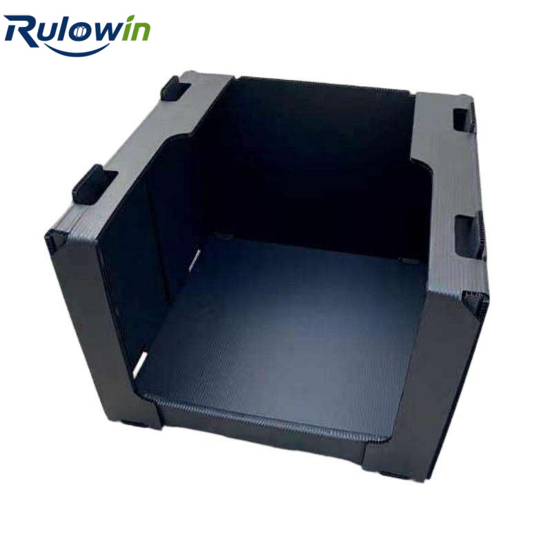
Colour in corrugated PP comes from masterbatch in the extrusion, so it is through the sheet rather than a surface coating — it does not scratch off. A few things worth knowing:
- Darker colours hide dirt, which is good for appearance and bad for spotting contamination. Lighter interiors are easier to inspect.
- Some pigment packages slightly affect the sheet’s mechanicals at high loadings; for a picking box this is rarely relevant, but worth confirming for a heavily loaded application.
- Minimum order quantities apply per colour. If you want five colours, expect a larger minimum than for one — or standardise on three and accept it.
How to introduce it without a project
Start with the highest-error zone, not the whole warehouse. Change the boxes in one aisle, measure the error rate for a month, and let the result argue for the rest. A scheme that spreads because it works survives; one that arrives by memo gets quietly abandoned.
If you tell us your zone structure and the colours you have in mind, we can quote a mixed-colour supply and advise on what is practical at your volumes.